|
|
Third Porous Membrane Measurement (4/2/2010)
(click images to enlarge)
PETEX Polyester Mesh
Another performance measurement was taken on April 2, 2010. As noted in prior articles, the parachute
Nylon I was using for deturbulator membranes (skins) was dimensionally unstable with changes in temperature and humidity.
It would expand and shrink greatly, making the skins either extremely loose or very tight.
By using a polyester material I hoped to achieve more consistent results. I selected a product of
Sefar AG called PETEX.
This polyester fabric is woven from 34 micron threads with 1% open area.
It weighs 2 oz/yd2, compared to 1.2 oz/yd2 for the parachute Nylon.
It is also less flexible, but not stiff. I presumed that these differences would not prevent
PETEX from working. This was based on the assumption that the aerodynamic forces acting across the membrane are strong enough
to dominate the interaction modes, with little significant influence from membrane mass and stiffness using any reasonably light,
flexible material. Following are images of the new polyester skins as tested on 4/2/2010:
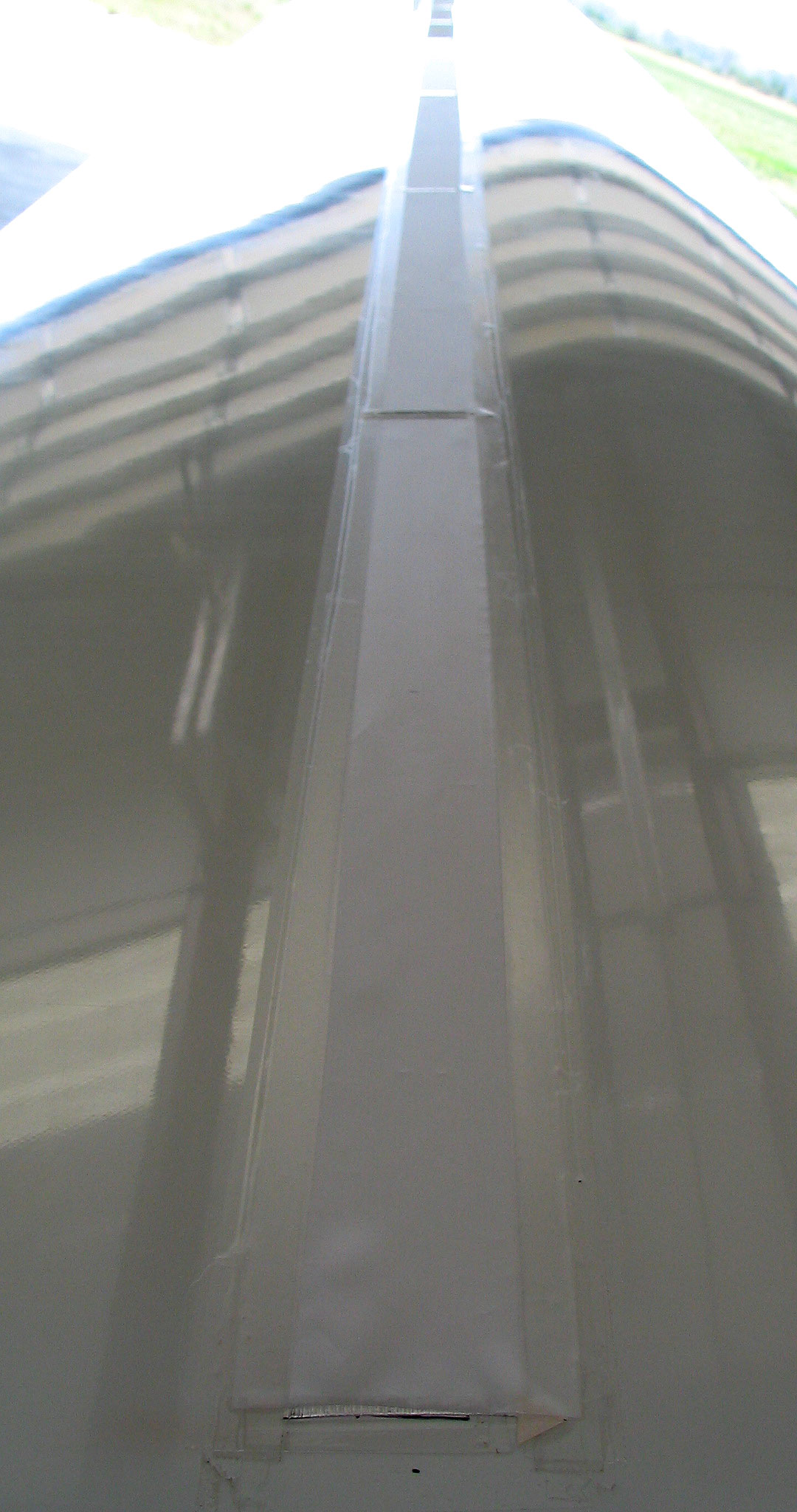
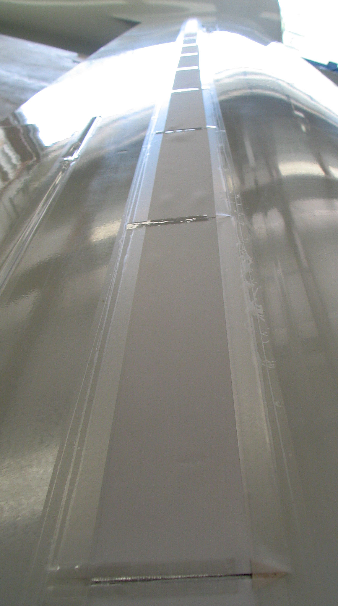
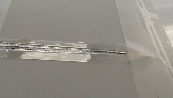
As you can see, the PETEX skins lay flat, but are not stretched tight. A finger can easily move the skins slightly in the streamwise direction. Compare these images to the parachute Nylon used on 6/20/2009. Based on observation of the parachute Nylon ballooning up when flying with extra wide deturbulators, I concluded that discrete vents are needed for top-wing-surface deturbulators, even with porous skins. So, I installed vents that use a rear-facing step to prevent in-flow problems. I have concerns now that this vent design will introduce a speed dependency, since they will tend to hold the skins down with greater force as the speed increases. One of these vents is pictured below:
Measurements
The forecast for 4/2/2010 looked good for a test flight.
The inversion was predicted to be below 3000 feet and, although the winds aloft would be over 40 kts, the
potential of shear from changes in speed or direction, was not indicated. So, I decided
to give it a try. The following plot of polar data from sink rate measurements shows the results:
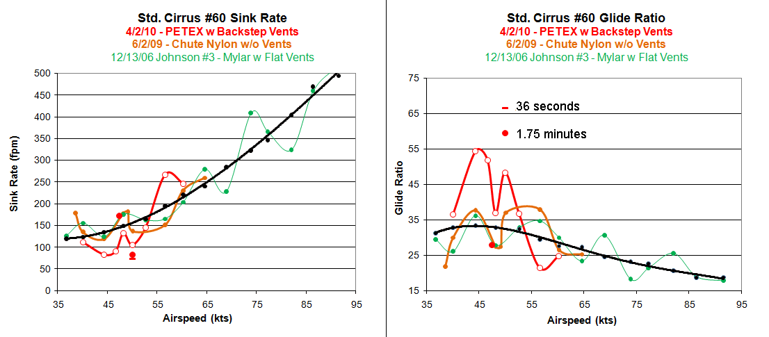
The red curves are from this flight. The orange ones are from the flight on 6/2/2009 using parachute Nylon without vents. The green curves are from Dick Johnson's second flight on 12/13/2006. In the present data, the points on the red curve on each side of the 50 KIAS (knot indicated air speed) point are 2 kts away; i.e., 48 and 50 KIAS. Later in the flight, I measured 49 KIAS and then measured the 52 KIAS point for a second time. The solid red dots indicate those measurements.
It was unusually hard to hold the 49 KIAS airspeed, as the glider kept trying to slip up to 50 or down to 48 kts. Nevertheless, I was able to hold it well enough for a good measurement. The second 52 KIAS point was held for four minutes. During that time, the performance flattened out and held for almost two minutes. The solid red dot at 52 kts is an average over that period. The flat bar indicates the maximum performance measured during that period. The trend over time while holding 52 kts is indicated by red curves plotted near the bottom of this page. Since this time trend has occurred in two prior flights, it is reasonable to think it is true. So, what value should be plotted to best represent the 52 kt speed, the one taken at high altitude or a value from the four minute measurement? I chose to create a second plot that includes the 49 kt point and takes the 52 kt data from the second measurement.
Second 52 Knot Measurement
When the 49 kt point is added to the curve, then the notch descends to exactly the value measured on two prior
occasions. That is very interesting. At 52 kts I plotted the best two minute (3.3 times the usual measurement period)
average from the four minute second measurement. This produced the following graph which I think best represents
performance measurements from this flight using polyester, PETEX membranes with reverse-stepped vents between panels:

The first feature that catches the eye is the distinct performance notch at 50 kts indicated (KIAS). This almost exactly matches the notchs on 6/2/2009 and from Johnson's second flight on 12/13/2006, but is much sharper. The sharpness of the notch probably indicates the reason that it was difficult to hold the 49 KIAS precisely. It appears to be a point of extreme instability.
The Peaked Pattern
The second pattern that I sometimes get flips the 50 KIAS point and neighboring points upside down.
This pattern is shown below below:
The essential feature that distinguishes these two patterns is the polarity of the performance deviations centered around 50 KIAS. In the "notched" case, 50 KIAS produces a performance loss while neighboring speeds on each side show a performance boost. Whereas, in the "peak" case, 50 KIAS produces a very large performance boost while neighboring speeds show a performance loss. I now have three examples of each pattern. That should suffice to establish that these extreme deviations from normal performance are not random events deriving from atmospheric conditions. It now appears that I am about as likely to get one pattern as the other. Evidently, there are two prominent flow-surface interaction modes that are about equally likely to occur, given the poor control over membrane tension that I have had to date. It may be that the polyester fabric will yield more consistent results.
Theory
To date, we do not understand these flow-surface interaction modes. But an associate, Jari Hyvärinen, developer of the
Linflow software package, is working to model these modes
using Linflow which is designed specifically for aeroelastic flow-surface interaction problems.
His software handles very small-scale dynamic effects nicely.
Our hope is that jis work will indicate how to a device that will ensure desirable modes.
To enlighten the problem, I am in the habit of calculating moving average performance analyses at constant airspeeds. Below are plots of performance vs. time from three flights at 50 or 52 KIAS when the speed was held for several minutes. The red curves are from the second measurement at 52 KIAS on this date. The brown ones are from the flight on 5/22/2009 using parachute Nylon without vents. The blue curves are from Dick Johnson's third flight on 12/13/2006.
Right away one is struck by the repeating "mesa" pattern, also that the duration these measurements are identical. This is amazing, considering that in each case, the pilot was trying to hold the target airspeed precisely, with as little variation as humanly possible. Yet, in each case, the performance ramped up to extreme values, then hung there for a minute and then began declining. This repeating pattern is convincing evidence of a repeating dynamic process. These cannot be random errors from atmospheric conditions!

Finally, I have included below an image (click to expand) of the flight profile (altitude vs. time) for the entire flight. Each speed run is clearly visible between "barograph notches," bobbles in the altitude that delimit the speed runs. The blue curve is GPS altitude data and the red one indicates pressure altitudes. Pressure altitudes were used for this analysis. Speeds are labeled in KIAS.
After the initial measurements, I measured 49 KIAS and then 52 KIAS a again. This time I held 52 kts for four minutes. The quality of the data in each segment can usually be judged by the linearity of the line segment. However, when the performance changes, the line segment will be nonlinear. This is obvious in the distinct S-shaped 52 kt point. I held that point for four minutes, five times longer than normal. I was trying to see if the "mesa" pattern would repeat and it did. The center of this segment is the highest performance region. It lasted one full minute. It is tempting to claim that the waviness of this segment is due to a region of convection in the air. But, curves like this do not occur in the other segments. Also, numerous cases of discontinuities at the edges of high-performance speed runs (scroll to the bottom of the page) have been documented. These occurences are too many to be coincidences. Finally, the repeating "mesa" shape of the performance time-trend indicates that the S-shape profile is not a random occurrence of convection.
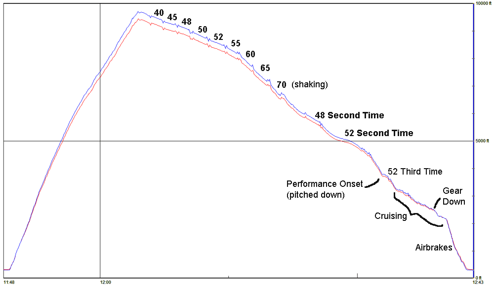
Illustration of Extreme Performance
Often, deturbulator performance occurs suddenly when approaching a performance airspeed.
Below is a 3D reconstruction of a section of the flight path from log data.
When, slowing down, extreme performance kicked in at 52 kts.
While holding the speed steady
- the altitude jumped 29 ft,
- the glide slope flattened,
- the nose pitched down noticeably and
- the sink rate declined from 4.5 kts to 1.7 kt.
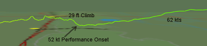
The last two can be viewed in the video clip below. The downward pitch at 52 kts indicates increased lift that was forced to remain equal to the glider's weight by holding the speed constant. That necessitated a decrease in the AOA to spill off excess lift.
The following video clip covers the entire event from the onset to the end. The performance event ended when the speed was allowed to drift across the 49 kt performance notch (second graph above) which caused an upward pitch motion as the lift failed. However, the speed kept going into the 48 kt performance peak(second graph above). This produced a strong pitch down. At that point my response was too slow to hold the 48 kt speed and the momentum of the down pitching motion carried the glider beyond the equilibrium point so it quickly built up speed again, crossing back over the 52 kt performance peak to the high side where the performance is generally poor. And that ended the event with a diving dip that can be seen in the flight path (image above).